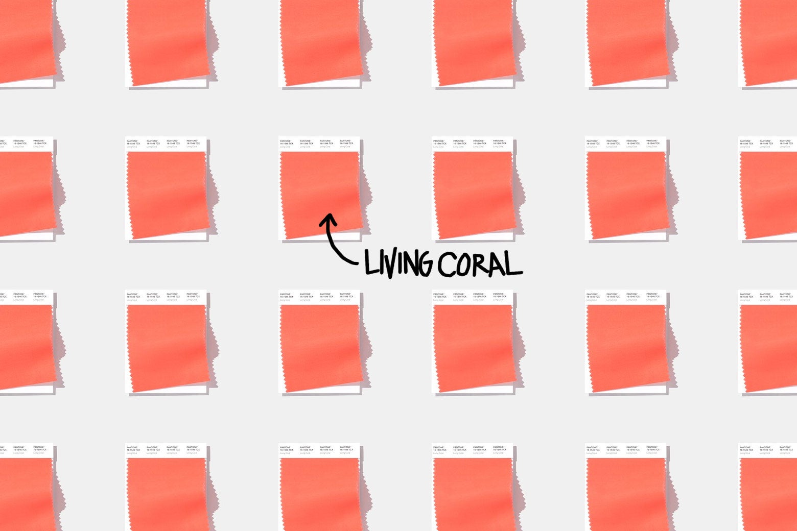
Something insidious is going down at the Pantone Color Institute. Each December, the company announces a new Color of the Year—and its 2019 selection, a warm pink tone called Living Coral, feels like a troll directed at a planet rapidly growing inhospitable to the many organisms that call it home.
In this context, the word living drips with (pink) shade. Pantone might as well have named it “The Rare Coral That Has Not Yet Been Bleached, as It Inevitably Someday Will in This Increasingly Toxic Toilet Bowl We Call Earth.” Blithely describing the color as a source of “emotional nourishment” and akin to “a big hug,” Pantone Vice President Laurie Pressman told the Associated Press that, yes, Living Coral is indeed a shoutout to the reefs around the world that are dying off in warming seas. In the Great Barrier Reef alone, one 2016 bleaching event killed almost 30 percent of shallow-water corals. Does that make you sad? Wrap yourself in the big, comforting hug of the color those graying coral skeletons used to be!
I might have interpreted Pantone’s choice as a more earnest attempt at wokeness or social impact if Pressman hadn’t posited the color as a source of escapism. “With everything that’s going on today, we’re looking for those humanizing qualities because we’re seeing online life dehumanizing a lot of things,” she said. “We’re looking toward those colors that bring nourishment and the comfort and familiarity that make us feel good. It’s not too heavy. We want to play. We want to be uplifted.” Hold up—the color chosen as a tribute to a fast-dying ocean invertebrate is supposed to make us feel … good? Uplifted? Ready to play what? A game of water polo over a million acres of bleached reef? How is a direct invocation of the specifically not-dead variety of a thing that could be entirely dead in our children’s lifetimes, due to our own greed and stubbornness and moral bankruptcy, “not too heavy”? Luckily, according to the AP, “it’s a color that seems to work for everybody … from art and housewares to home interiors and industrial design.” What a nice future this will be, with Living Coral coloring our ottomans and living coral struggling toward certain extinction.
This isn’t the first time Pantone has cheerfully, demonically brought the specter of our encroaching dystopia to bear on consumer goods. The 2018 Color of the Year was Ultra Violet, both the color of a bipartisan electorate (“it takes two shades that are seemingly diametrically opposed—blue and red—and brings them together to create something new,” the executive director of the Pantone Color Institute said) and (coincidentally?) the gravest possible level on the California wildfire risk scale, which officials had to use for the first time during the season the color was announced. In 2017, the Color of the Year was Greenery, which Pantone described as “life-affirming”—the same adjective it deployed for Living Coral. As forests burn, reefs wither, and far-right politicians turn lush carbon sinks into hubs for methane emission, why must Pantone taunt us by praising the life-affirming nature of all the stuff that’s dying?!
“The more submerged people are in modern life, the greater their innate craving to immerse themselves in the physical beauty and inherent unity of the natural world,” Pantone said in its Greenery announcement. This points to a common thread in the company’s worrying sequence of color choices. As these real-world colors fade away, Pantone is hoping we’ll take solace in their artificial manifestations, vis-à-vis throw pillows and scarves. No more rainforests or coral reefs? Greenery and Living Coral will make for adequate substitutes in the interior design of the impermeable bubbles of filtered air we’ll one day inhabit. Pantone sold the 2016 Colors of the Year—the first dual choice, a pink and a pale blue called Rose Quartz and Serenity, respectively—as a nod to “societal movements toward gender equality and fluidity,” a bizarre explanation of the two colors most associated with a gender-binary indoctrination that begins at birth. Viewed through the lens of Greenery and Living Coral, that choice could be read as Pantone’s wistful salute to a binary that may go the way of greenery and living coral someday soon. Guess the future will have an upside after all!
When Pantone finally chooses black or mud-brown as its color of the year—shades of ash and mudslide, perhaps—I guess we’ll know we’re really in trouble, because Pantone will have been unable to find a pink or purple buoyant enough to distract us from certain doom. Until then, I just hope they start choosing colors based on things that aren’t incrementally vanishing from the face of the planet. No electric-blue Icecap. No cream-toned Polar Bear Fur on Living Polar Bear. Definitely no Sea Level (Normal). I want the Colors of the Year to populate my closet, not the Earth’s in memoriam reel.